


What topics are you interested in?

ZEIT STIFTUNG BUCERIUS now appears at the top of this website, printed in all capital letters. For the first time in two decades, we have fully redesigned the logo, fonts and appearance of the ZEIT-Stiftung Ebelin und Gerd Bucerius – and in the coming months we’ll be making similar alterations in the descriptions of our projects and in future publications.
In doing so, we are making the name of our founders particularly evident: BUCERIUS. The previous logo presented “ZEIT-Stiftung” in large, bold type with “Bucerius” appearing in slightly smaller letters. In everyday dealings, the relatively lengthy name of our foundation was almost always shortened to the “ZEIT-Stiftung”.
In the new logo, BUCERIUS is especially pronounced.
Why?
Because we are proud of Ebelin and Gerd Bucerius. As managing director of the Zeitverlag and as publisher of DIE ZEIT, they both advocated an open and tolerant society. Their values still shape our funding efforts. “Clearly addressing social challenges and – when necessary – taking a firm position. These are qualities in the tradition of our founders Ebelin and Gerd Bucerius. Now, such clarity and aspiration will also be reflected in our branding,” says Burkhard Schwenker, Chairman of the Board of Trustees, explaining the decision.
Because we want to make the link to our flagship projects even clearer. Over the past two decades, the foundation has launched two highly regarded institutions that bear this family name: BUCERIUS LAW SCHOOL and the BUCERIUS KUNST FORUM. The name also features prominently in other funding programs and projects sponsored by the foundation, these including the Bucerius Summer School, the Gerd Bucerius Scholarships of the Deutsche Stiftung Musikleben and the Bucerius Daycare Center.
“The ZEIT STIFTUNG BUCERIUS functions through its institutions and its projects. Our efforts link the work of the foundation with its institutions. The enhanced appearance of the name BUCERIUS depicts this interconnection even more emphatically. The new logo also emphasizes the lifetime achievements of Ebelin and Gerd Bucerius,” says Manuel Hartung, Chairman of the Executive Board.


Because we want to take a stand with this strongly contoured logo. Unambiguous messages but nuanced decisions define our history. Our founders believed that skillful intervention and fearless engagement were essential for a democratic society. This vision shaped their design of the weekly newspaper DIE ZEIT. Together with his wife Ebelin, who was managing director of the Zeitverlag from 1951, Gerd Bucerius believed in taking a clear stance: “Genuine freedom means risk.” Fellow travelers such as Helmut Schmidt and Theo Sommer told of loud arguments with Bucerius, filled with fierce debate and shrewd conclusions. It was in this same spirit that Gerd Bucerius founded the ZEIT Foundation in 1971 as a voice and forum for an introspective civil society. Inquisitive, dialogue oriented and tolerant. These are the values that have characterized the foundation since its inception, and they are the same values that continue to shape its funding work – all in the spirit of Ebelin and Gerd Bucerius.
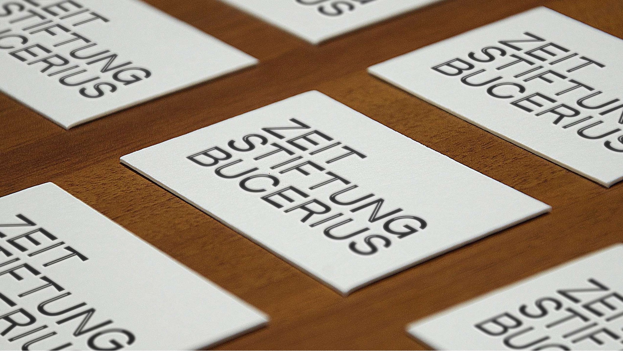
With these principles in mind we’ve redesigned our logo. We are particularly pleased to be using a font specially designed for our foundation: “BUCERIUS CAPS”. Slightly angular in style, it borrows from the long tradition of DIE ZEIT, the letters show highlighted slits and are capable of withstanding the blustery gales sometimes faced in Hamburg. Manuel Hartung is convinced that this is what the foundation stands for: “In setting yourself the task of defending freedom, creating space for expression and providing orientation, you also need to be able to withstand headwind.”
The entire process – from core brand development to settling on a final corporate identity to creating a new logo and website – took almost exactly one year. It started with the pitches made by several agencies who presented their ideas for the foundation’s new image. Working with the agency SocialSocial, the transformation began. “In the course of a year we’ve turned the ZEIT STIFTUNG BUCERIUS on its head, rethought past practice and fine-tuned our approach. As a result, we can now better communicate just what the ZEIT STIFTUNG BUCERIUS stands for,” says Jessica Staschen, Head of Communications.
Despite all the changes, one thing remains the same: we will continue to passionately and resolutely support outstanding projects and initiatives that strengthen and unite our free society.
We welcome your feedback. How do you find the name change? What do you think of the new design? Write to us at post@zeit-stiftung.de.


